Setting New Standards With Rite Aid
What We Did
Signage was a key element to the new Rite Aid brand. DMA worked with Rite Aid to create brand standards for their new design & color palette for their “stores of the future” committed to the wellness of their customers.
TASK
Solution
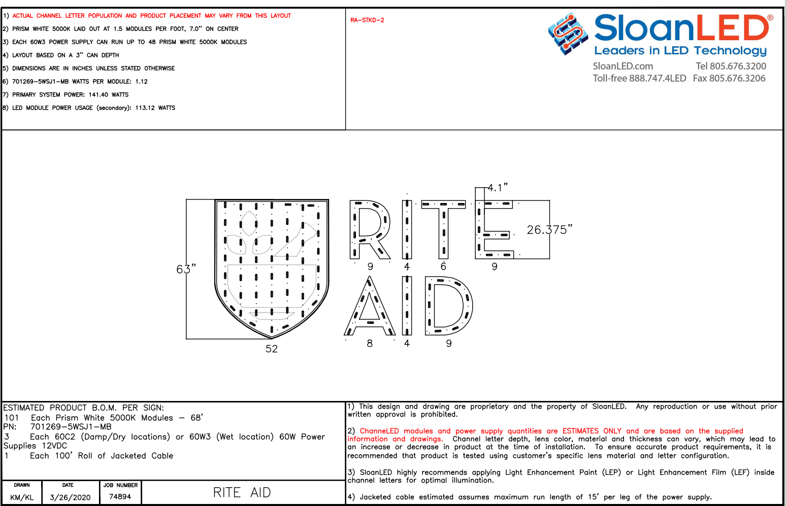
The client was looking for a “more sophisticated look” to their letters so we looked to Optix nonglare as a viable option.
They wanted bright letters, but not a color that was too cold and not complimenting the new color. We suggested a color corrected option of 5000K that would work with their core colors including the background color, white.
Substrate
Plaskolite Optix 7328LD white nonglare for white channel letters & Rite Aid shield.Plaskolite Optix 2447LD for dual color & translucent RA green and blue film
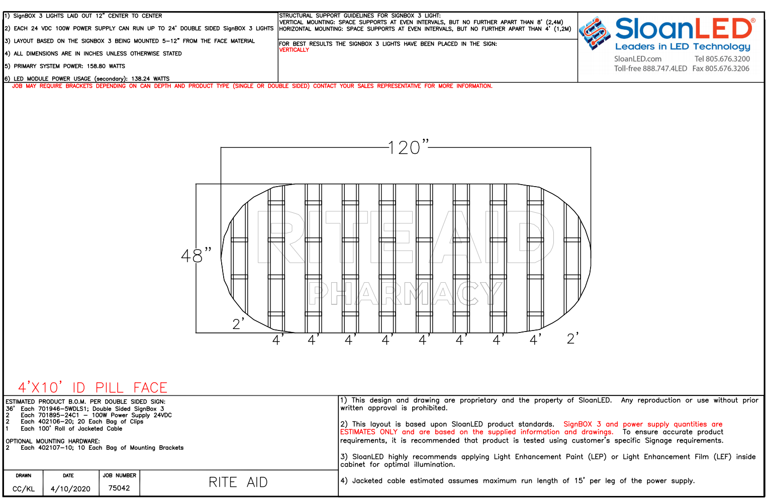
Plaskolite SG05 White impact modified acrylic for sign cabinets and monument signage.
RESULT
The client was pleased with the end result in achieving an increased awareness of Rite Aid and their brand. Visible signage, fresh new color scheme were all part of their brand awareness. The end result is increase in foot traffic and positive outlook in the direction that Rite Aid is taking.


READY TO LEARN MORE?
WE ARE HERE TO HELP!